AI Search
Coverage
enhancing search with
data visualization
| Project Type | Concepting, Interaction Design, Data Visualization |
|---|
| Role | Experience Design Lead | Elise Ansher |
|---|---|---|
| Senior Experience Designer | Kevin Choi | |
| Service Design Lead | Michael Buquet | |
| Technical Lead | Michael Ramos | |
| Length | 6 months |
I created a dashboard to help researchers discern how much of the available documentation they have searched through and where else they may find relevant references.
Project brief and background.
I designed and built AI-Enabled Search with Google data scientists and a cross-functional development team to improve search at a federal agency that regulates intellectual property.
During the first project year the AES team stood up, tested, and iterated on our four AI-enabled features – Similarity Sorting, Similarity Insight, Add Results, and LCC Suggestions.
With initial functionality established, I wanted to explore what more we, and researchers, could learn from looking at our users’ behavioral data.
How much is enough?
My first step was to figure out what information would be useful enough for researchers to choose to spend time referencing instead of churning through documents.
Card Sorting
I started with 32 cards for researchers to order and group, collected from past user feedback and usage metrics captured by our data team on the back end.


Meeting one-on-one on Microsoft Teams & inVision Freehand, I asked researchers to consider how they track their progress as they categorized, arranged, and added to the cards.
I learned that there is no simple way to define "enough." Depending on what a researcher is working on, the number of searches & documents needed can vary a lot.
Sketches
I drafted low-fidelity wireframes representing each of the significant categories that our test-researchers created for another round of user feedback.


I asked researchers how and when they would use – or not use – different data points throughout their search user flow. We identified stages where users could benefit from data analysis.
What can we build?
I circled back with my data and development teammates to plan our technical approach and prioritize goals for the feature MVP.


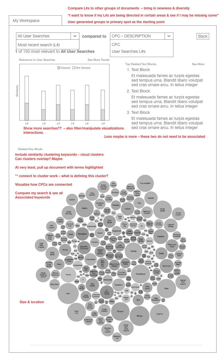
Working session notes on a mid-fidelity iteration
Balancing build feasibility, data limitations, and user needs, we pinpointed Tag Similarity, Query Newness, and Classification Check as the three core data visualizations.
mvp
With our minimum viable product outlined, I worked with researchers to refine interactions.
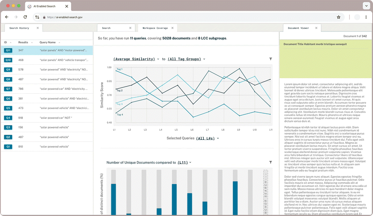
Tag Similarity
Researchers were excited to compare the average similarity of their tag groups to their queries plotted on a line graph but wanted to be able to tailor the data to their needs. Dynamic chart labels with drop down menus enable users to customize exactly what search data they want displayed.
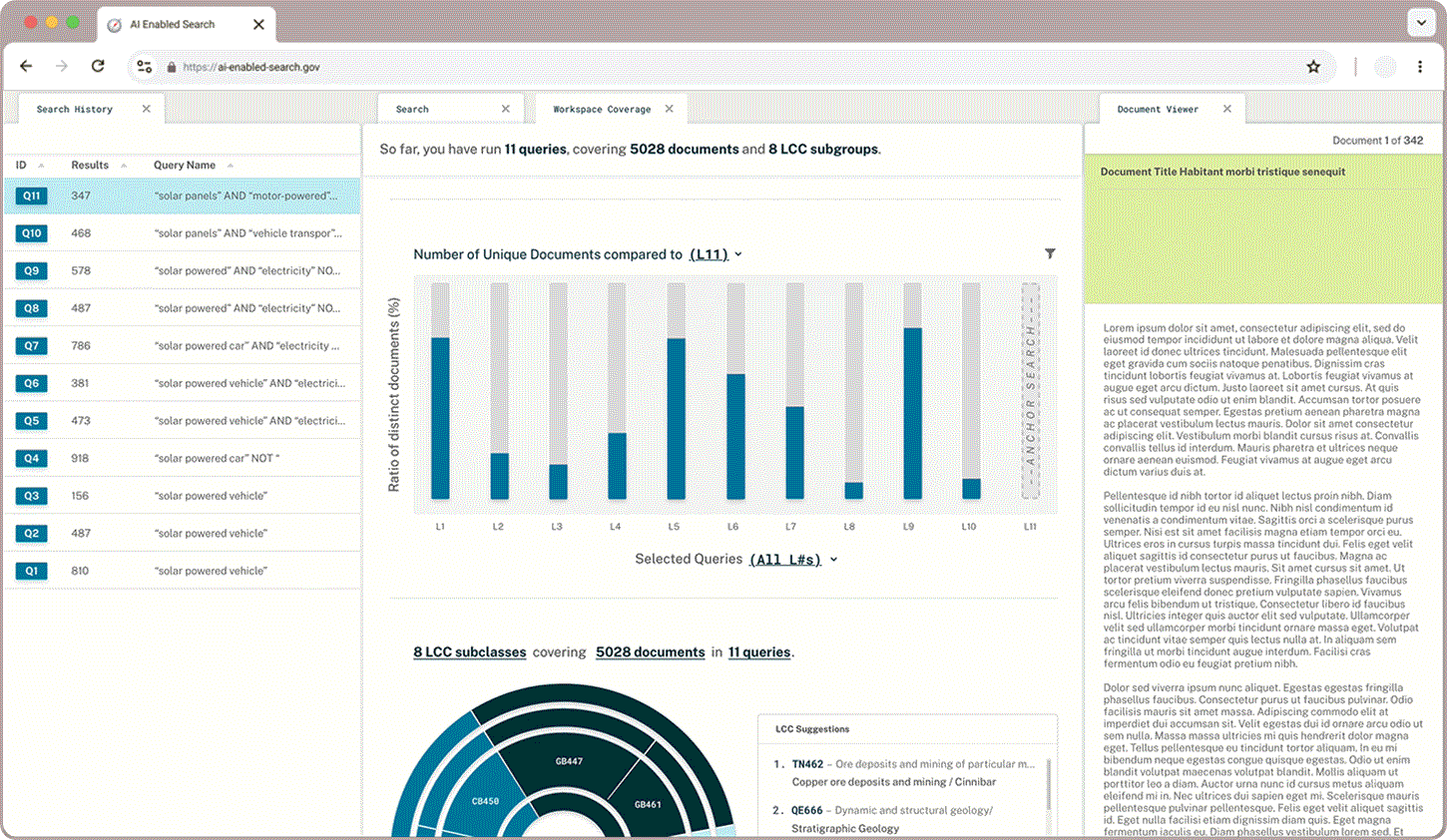
Query Newness
Newness displays how much overlap there is between an anchor query and other groups of documents. Users wanted to be able to toggle between seeing distinct or overlapping documents highlighted depending on whether they wanted to broaden or narrow their field of search.

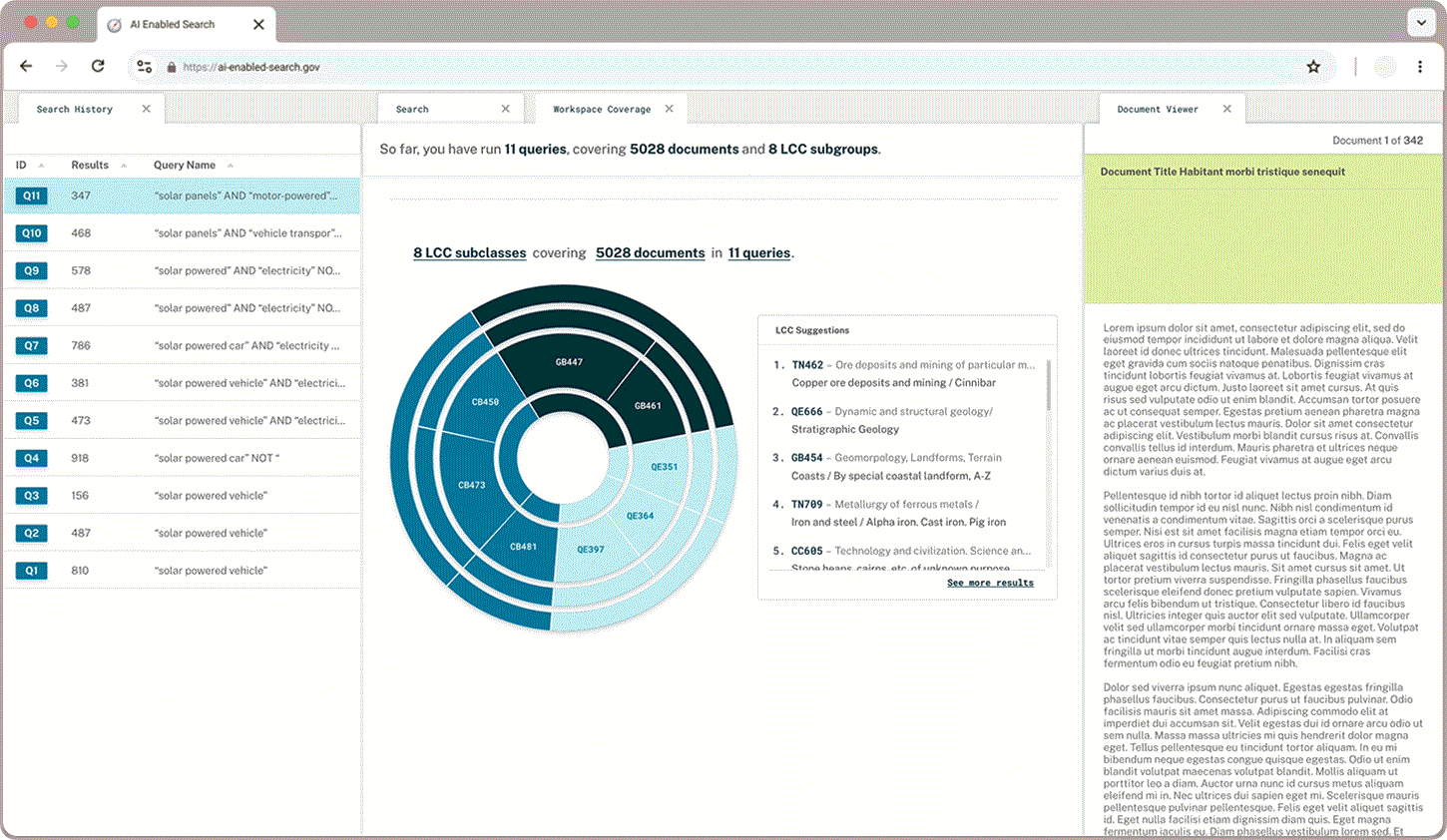
Classification Check
In addition to what proportion of documents a user has queried and read through, users wanted to learn more about the classifications that appear in their queries and explore the hierarchical structure. A sunburst chart paired with LCC suggestions gives users a sense of what they have captured already and where else they may find relevant documents.
Building AI into search.
Read more about how we designed and built the rest of the search plug-in in AI-enabled Search.