My Profile & Preferences

Redesigning My Profile and Communication Preferences for Cox.com to simplify the user experience and to scale with business growth.
| Client | Cox Communications | |
|---|---|---|
| Project Type | Service Design, User Research | |
| Role | Experience Design Lead | |
| Team | Senior UX Designer | Laura Medina |
| Senior Visual Designer | Maia Conlon | |
| Product Manager | Adam Bettancourt | |
| Researcher | Len Weimer | |
| Length | 2 months |
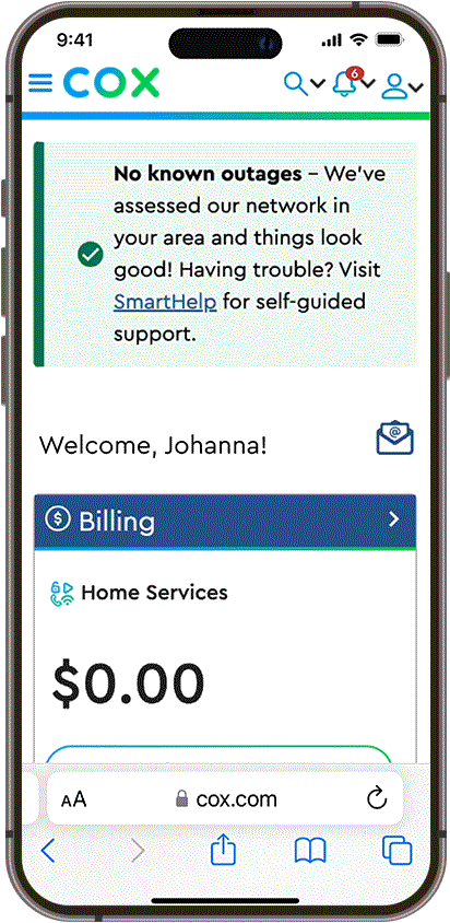
Hello, it's Cox calling!
Cox Communications is the largest private broadband and communications provider in the United States, with 670 service areas across the country.
Cox Corporate was planning to shift from an account-based to a user-based contact strategy. This way, service-areas could be associated with more than one user, making managing & moving services easier for everybody.
Our clients asked us to redesign My Profile & Communication Preferences on Cox.com to consolidate and simplify the user experience while also preparing for the data restructuring.
At the kickoff meeting we aligned on four goals to guide us and gauge our impact:
- Improve customer satisfaction.
- Drive communications engagement.
- Reduce unsubscribes and opt-outs.
- Mitigate compliance risks.
We planned to divide our seven-week timeline into two phases, with formal readouts held at the end of each and informal client check-ins weekly.
Phase 1: Discovery –
Week 1-2
Understand current state, business & user needs. Refine product brief and develop design hypotheses.
Phase 2: Design Sprint ––
Week 3-6
Define user journey and common entry points. Prototype design solutions and validate through usability testing.
The seventh week would be dedicated to addressing any remaining client feedback and questions in preparation for a seamless final handoff.
They would prefer not to.
Adam and I interviewed stakeholders to get more context on business needs and to better understand what was leading users to opt out of communications.
How Might We’s addressing each axis
Our interviewees described three axes that structure the overall experience – product, data, and service.

How Might We’s to address each axis
We learned that within these axes, siloed departments – product, marketing, digital, customer service, legal & more – each execute their own communication strategy with little-to-no coordination between them.
At the same time, I led the designers in evaluating the current state of preferences on Cox.com using a rubric I put together based on Nielsen Norman’s Usability Heuristics.
As a team, we discussed what was & wasn’t working, comparing Cox.com to competitors’ experiences and beacons, and defined three core principles outlining our approach to redesigning preferences:
01. Guidance
Support customers through their experience in the most efficient way, backed up by Cox expertise.
02. Clarity
Transparency and education without being overwhelming. Give users enough information to feel empowered.
03. Control
Meet customers where they are in their journey, giving them the confidence to accomplish tasks at their own pace.
Repaving the happy path.
To begin the design phase, I facilitated an ideation and prioritization workshop with the internal team, pulling together learnings from discovery.
Affinity-mapped experience goals
First, we categorized and regrouped our experience goals, discussing exactly what UX challenges we were trying to address.

Affinity-mapped experience goals
Then, we brainstormed how to test each idea to make sure that they were achievable and measurable going into user research.
With only two-and-half weeks until scheduled usability testing, I had the team focus prototyping on Cox.com’s mobile experience. Only after we had feedback from user research did we optimize the mobile-first user flow for other breakpoints, ensuring a consistent approach and patterns across devices.


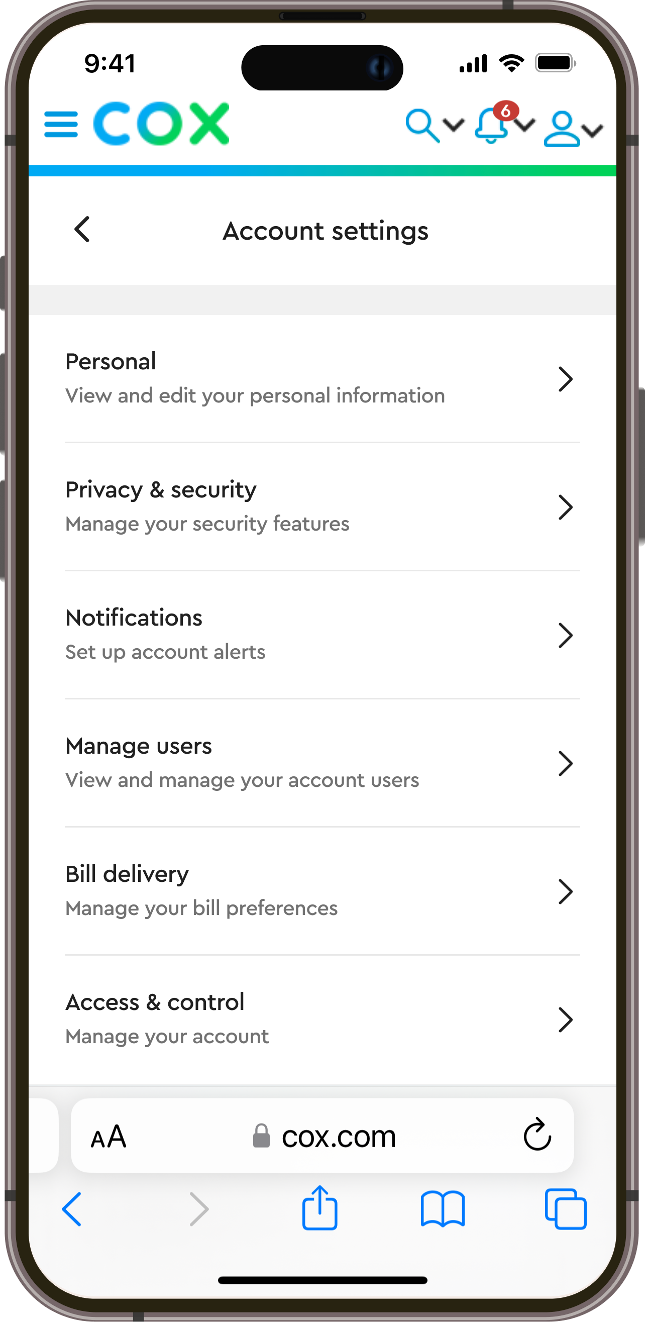
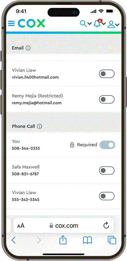
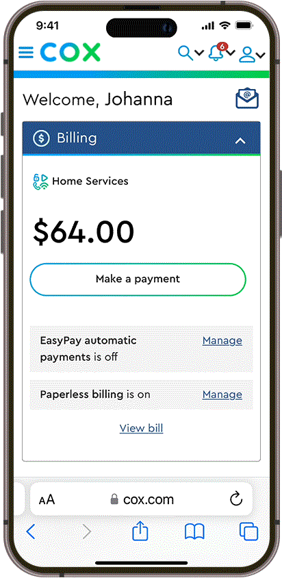
Current state preferences reflected the fragmented underlying approach to communications, requiring users to navigate Cox’s idiosyncracies without clear guidance.
I reorganized the information architecture to center on the customer journey, consolidating redundant categories and revising copy to better align with user goals.
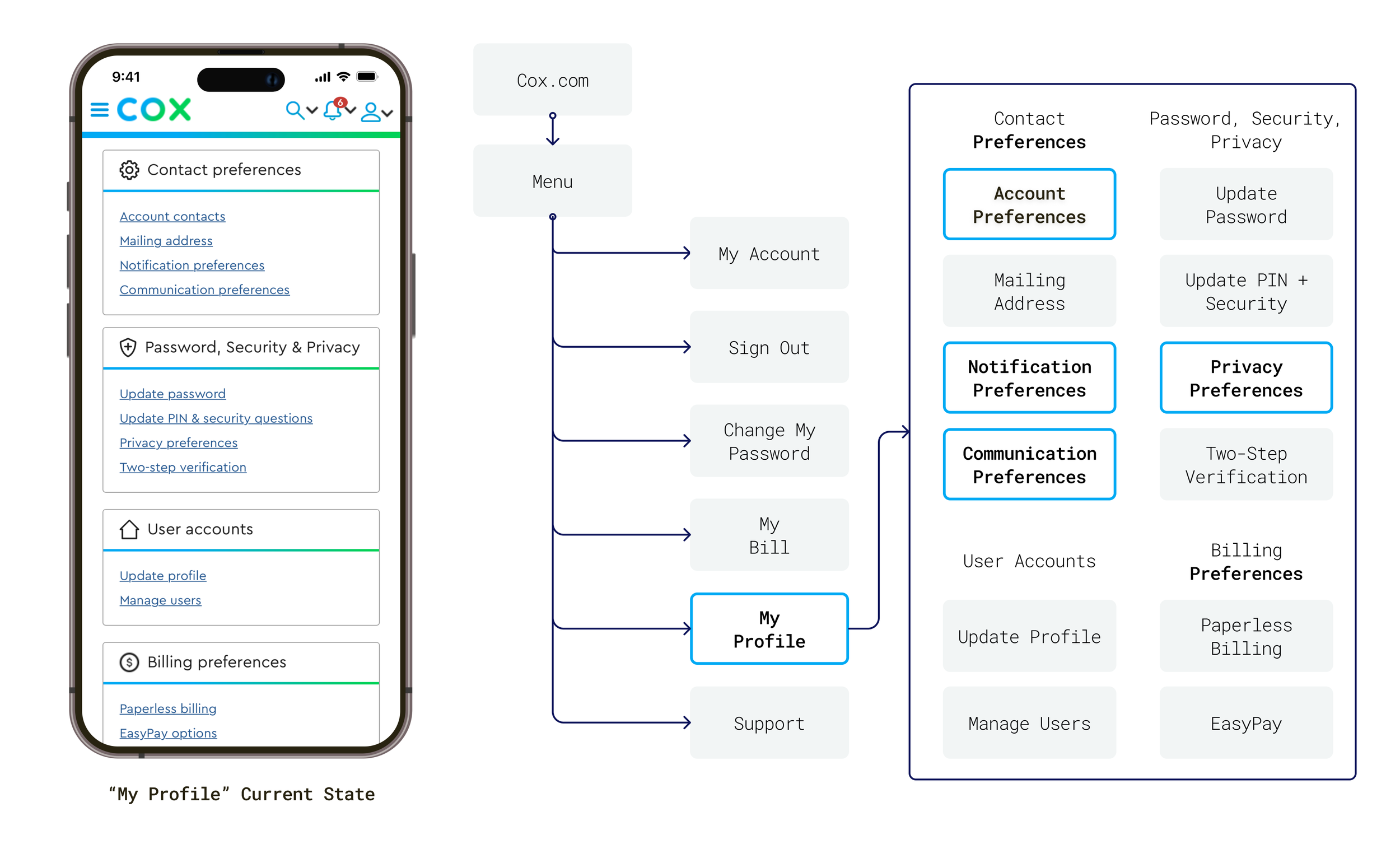
Currently, communication preferences are spread across several categories and subheadings in “My Profile”
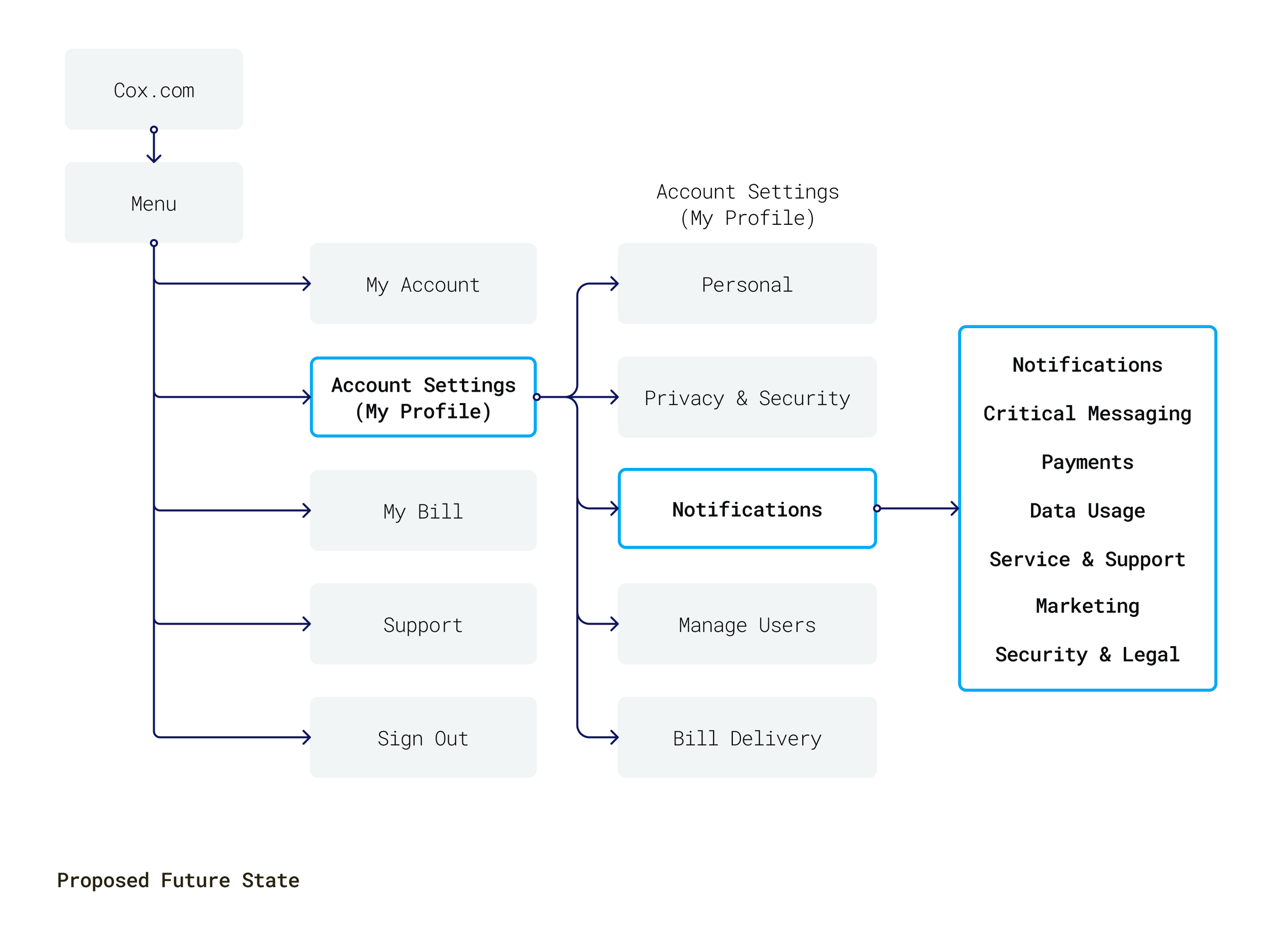
Proposed information architecture update consolidates categories and focuses user attention

Currently, communication preferences are spread across several categories and subheadings in “My Profile”

Proposed information architecture update consolidates categories and focuses user attention
Maia, Laura, and I collaborated throughout the sprint, trading feedback across successive iterations. Ultimately, we centered on seven design hypotheses to prototype out and test with users.
design hypotheses
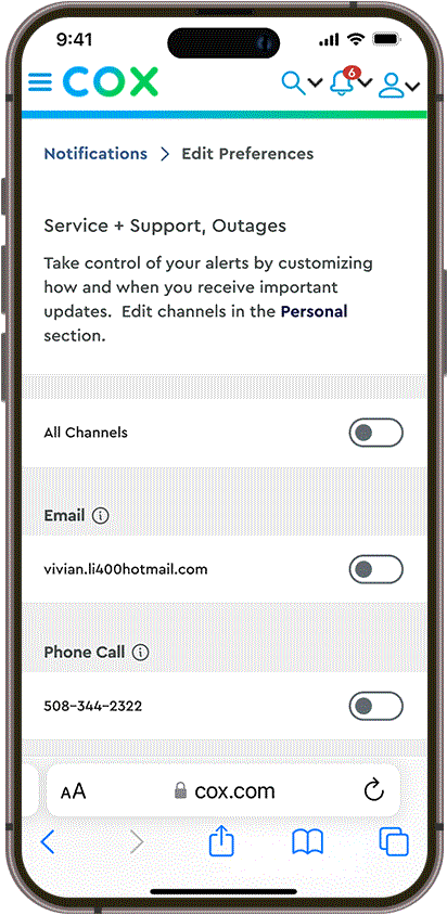
Researcher Len moderated remote testing sessions with ten current Cox customers who are primary ISP decision-makers for their household to evaluate the usability of our designs.
We tested both channel- and category-first concepts with everybody – five users began with channel-first, the other five with category-first.
Although participants received both channel- and category-first concepts positively, we uncovered usability issues across both user flows.
Guidance
Clarity
Control
Users intutively group notifications by category.
Guidance
Clarity
Control
Users intutively group notifications by category.
The category-led structure required fewer clicks and had more potential to scale and our test users found it more instantly understandable than channel-first.
For the final designs, we consolidated and reordered notification categories by what's most important to the user and introduced clear headings to help users make sense of their preferences and navigate with ease.
Testing: Channel-first required more screens
Final: Category-first has more direct path
Guidance
Clarity
Control
My Profile is more user-friendly as a streamlined list.
Guidance
Clarity
Control
My Profile is more user-friendly as a streamlined list.
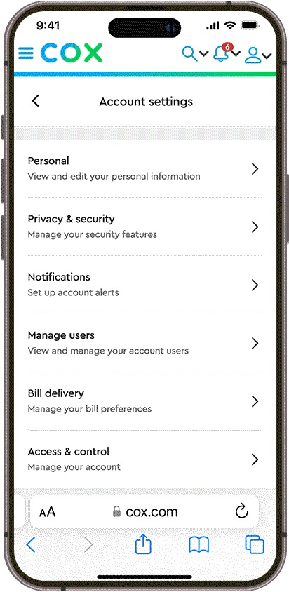
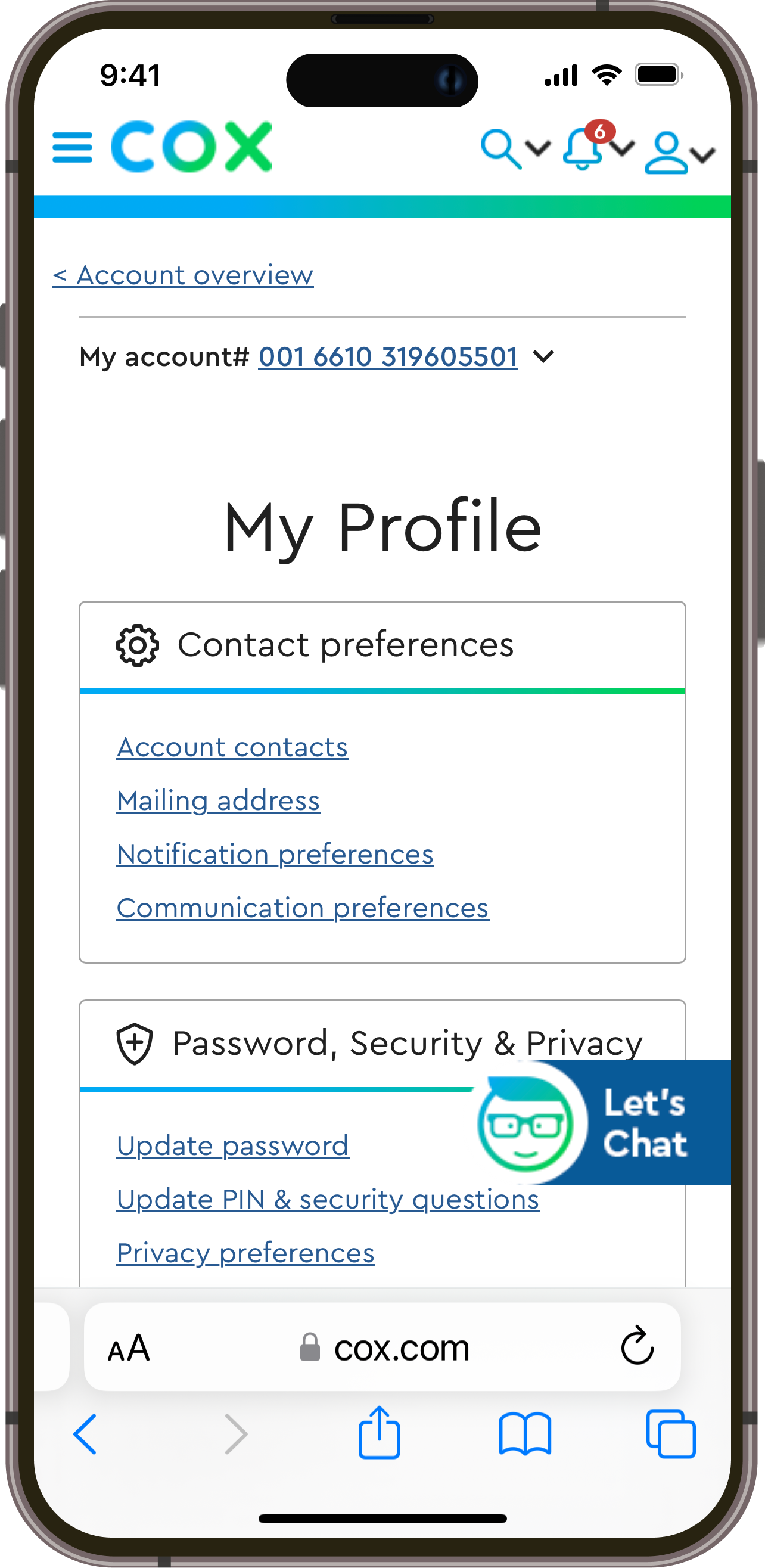
Retooling My Profile – renamed “Account Settings” – into a scannable list with short, contextual descriptions helps users find what they need.
Following user feedback, we revised subheadings and copy to be more descriptive and action-oriented. We also leveraged an existing breadcrumb react component enabling users to navigate Account Settings and reinforcing page organization.
Before: Clunky tiles and opaque categories
Testing: Users desired clearer subheadings

Final: Navigate with confidence and ease
Guidance
Clarity
Control
A simplified menu makes Account Settings easier to find.
Guidance
Clarity
Control
A simplified menu makes Account Settings easier to find.
Reorganizing the account menu navigation helps users to better understand the site’s overall structure.
During testing, users expected to find Account Settings following My Account and were able to effortlessly navigate there via the dropdown menu.

Before: Menu items had confusing hierarchy
Final: Menu order reinforces site logic
Guidance
Clarity
Control
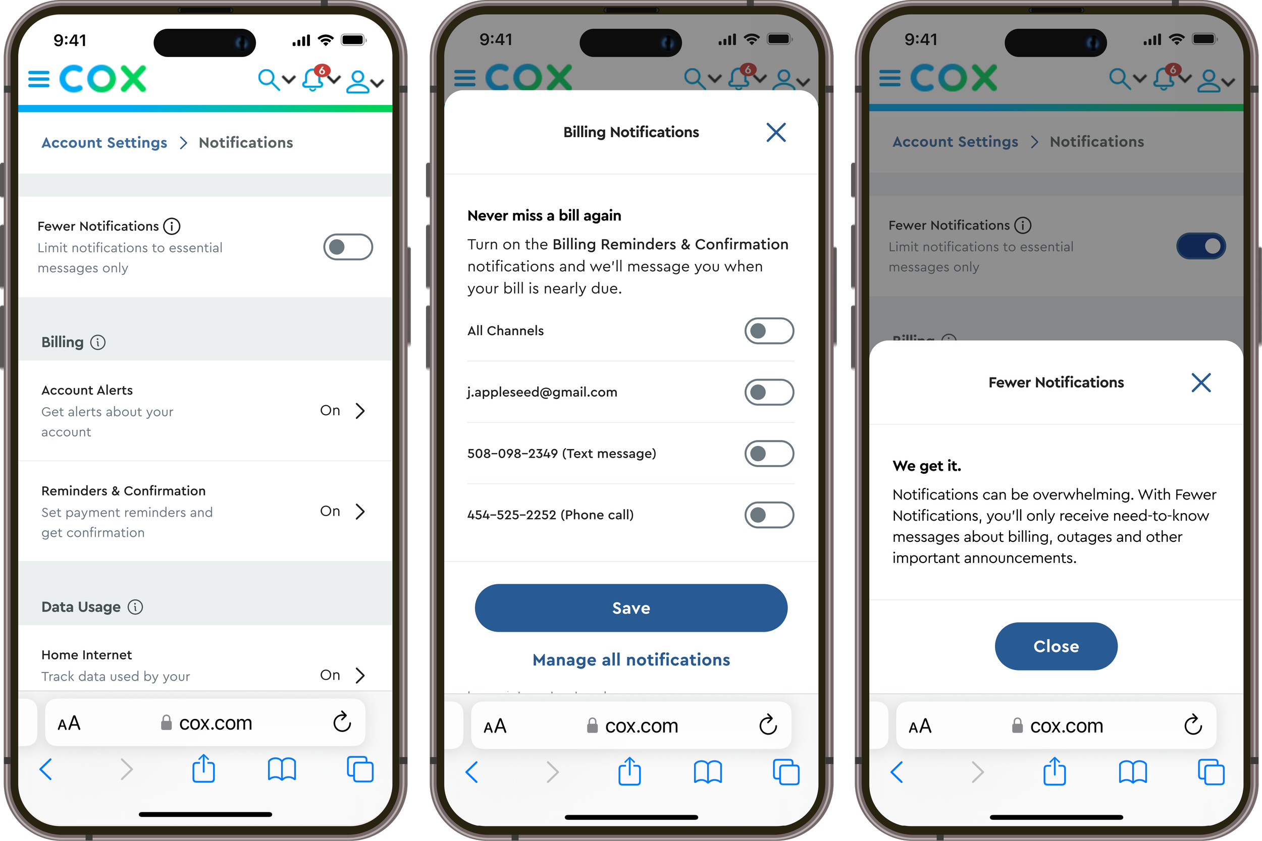
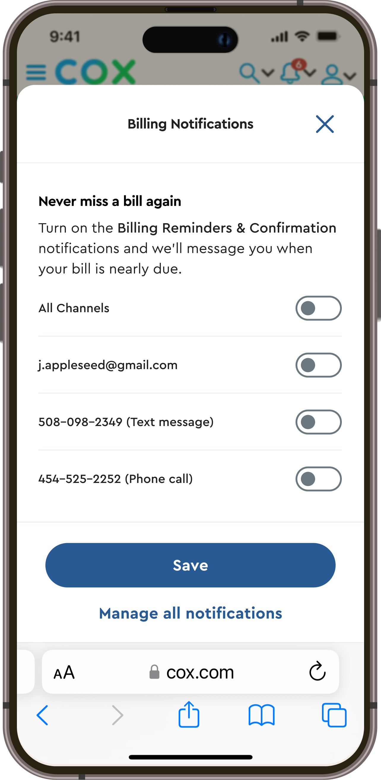
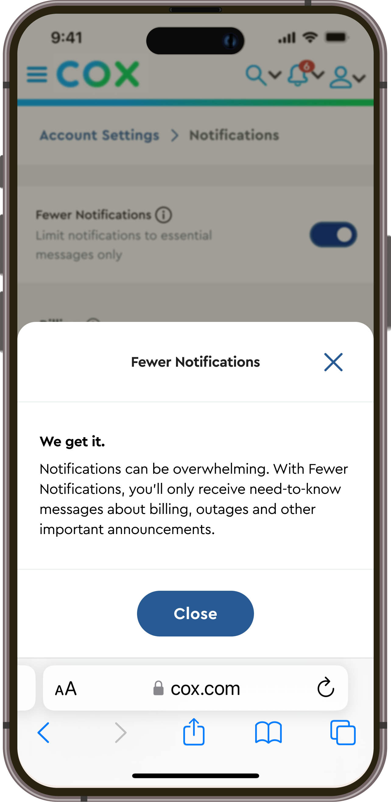
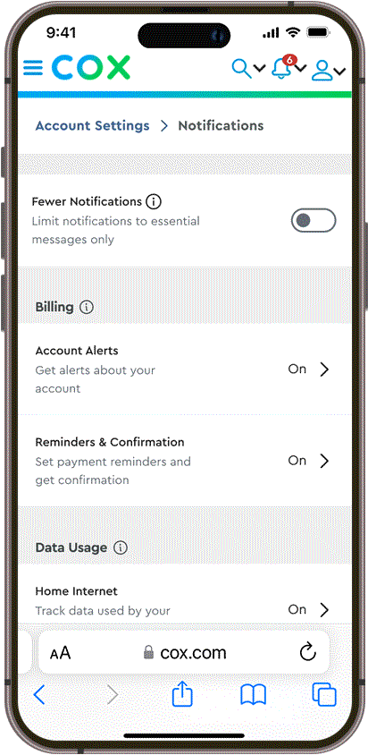
“Fewer Notifications” offers an option between all or nothing.
Guidance
Clarity
Control
“Fewer Notifications” offers an option between all or nothing.
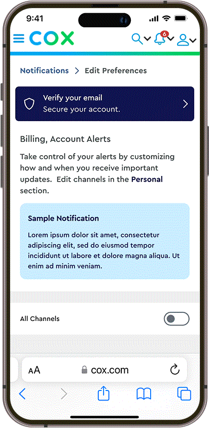
While test users were not sure what to expect from “Quieter Messaging,” they were interested in its time-saving potential.
After testing, we renamed it “Fewer Notifications,” pairing the more descriptive title with a more straightforward subheading and info drawer copy to clearly explain the feature’s promise.
Testing: Users found feature name ambiguous
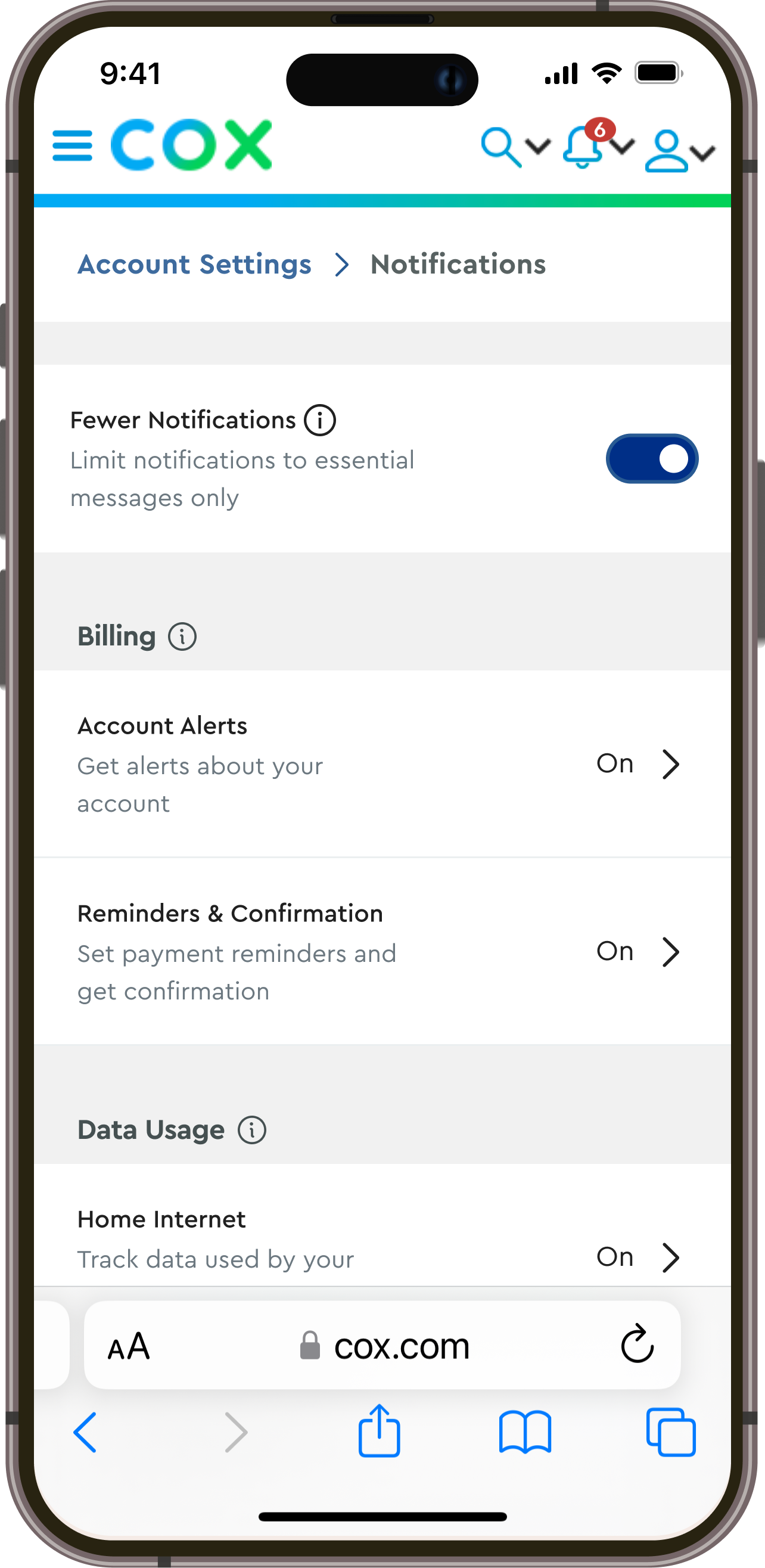
Final: Label and info drawer use more precise language
Guidance
Clarity
Control
Concise but specific language increases clarity and builds trust.
Guidance
Clarity
Control
Concise but specific language increases clarity and builds trust.
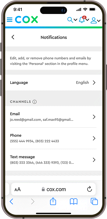
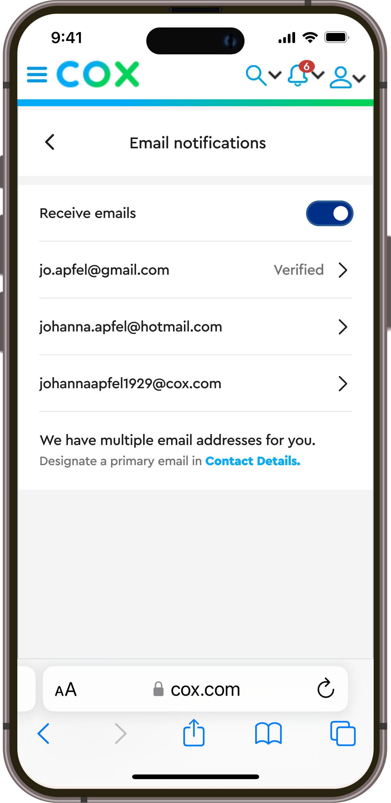
Plain language – e.g. changing “Manage Notifications” to “Notifications” and “SMS” to “Text Message” – helps users understand and orient themselves efficiently.
Our test users were not confident how to interpret “Always on” and “Locked” indicators. In response we labeled channels that cannot be changed “Required” paired with the disabled toggle to help users better understand.

Testing: “On” vs. “Always on” was not clear to users
Final: Label directly connected to input
Guidance
Clarity
Control
Be clear on why some actions are not available and link users to where they are.
Guidance
Clarity
Control
Be clear on why some actions are not available and link users to where they are.
Informative, actionable UI patterns based on recognizable info helps users manage preferences across multiple points-of-contact.
Following test user feedback, we refined instructional copy and treatments to better orient users to the boundaries between contact info, communication preferences, & push notifications.
Testing: Edit info and Push Notifications guidance confused users
Final: Links out of section are visually distinguished
Guidance
Clarity
Control
A little friction can create more focus and comprehension.
Guidance
Clarity
Control
A little friction can create more focus and comprehension.
Resurfacing preferences at relevant moments in the user journey is an opportunity to highlight notifications as a benefit.
Users liked being asked to reengage with their notification preferences based on their behavior or account activity – especially when it could help them save money.

Testing: Testing: Users wanted more granular control
Final: Focus in at the deepest relevant category
One big, happy family plan.
The new Account Settings framework is built to accommodate multiple users and multiple service locations as Cox’s business needs evolve.
Structurally, the account’s primary user will manage account users and assign roles in My Account. An account user’s role determines what channels and permissions they are able to access in Account Settings.

Ready to support multi-user accounts
01.
The primary account user accesses administrative functionality in Manage Users under My Account.
02.
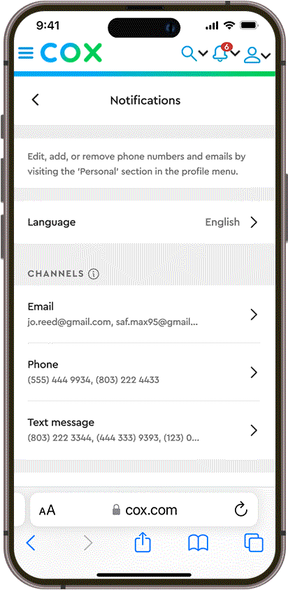
In Notifications under Account Settings, all users will find options to select service locations that correspond to their assigned set of permissions.
Our modular, cell-based page layouts flexibly adapt to the all of My Account, Cox.com and other viewport breakpoints.

Desktop-width responsive

Primary account user view
Non-primary account user view
As the first project in Cox’s Self-Service initiative, our work lays the foundation for planned projects in My Account and in other workstreams across both Business and Residential divisions at Cox Communications.