Blockly Brand Expression
Building a fresh brand narrative and landing page to represent Blocky's mission and showcase their position as an edtech leader.
| Client | |
|---|---|
| Project Type | Vision, Strategy, Landing Page Design |
| Role | Experience Design Lead |
| Team | Visual Design Lead | Athalia Rahman |
|---|---|---|
| Senior Visual Designer | Ignacio Torres | |
| Creative Direction | Seth Mach | |
| Length | 4 weeks |
The building blocks.
Blockly is Google’s open-source Javascript library that empowers anybody to create and customize a block-based code editor for their software development projects.
The drag-and drop interface invites end-users to learn to code by snapping together blocks that visually reinforce correct syntax. Today, “tens of millions of students have now learned to code on platforms and tools built on Blockly" since launching in 2012.
Education for Social Impact at Google asked our team to create a compelling brand narrative realized through a progressive web experience that will support Blockly’s aim to encourage and grow partnerships.
Interviewing stakeholders offered perspective on the brand’s current state & their hopes for success, showing that the new landing page should:
- Spotlight Blockly’s work in promoting and diversifying computer science education for all
- Underscore that block-based coding through Blockly is an accessible entry point for programming
- Communicate the scale of Blockly’s impact internally and externally.
Discovery
I reviewed comparable products & brands to see how Blockly measured up both within Google and across the wider web.
Beacon examples for narrative, brand positioning, and interaction helped us to contextualize Blockly’s challenge.
I/O plays within the Google framework to express its unique identity.
Intel turned its position as an ingredient brand into its strength.
Apple’s single scroll keeps the experience as simple as the message.
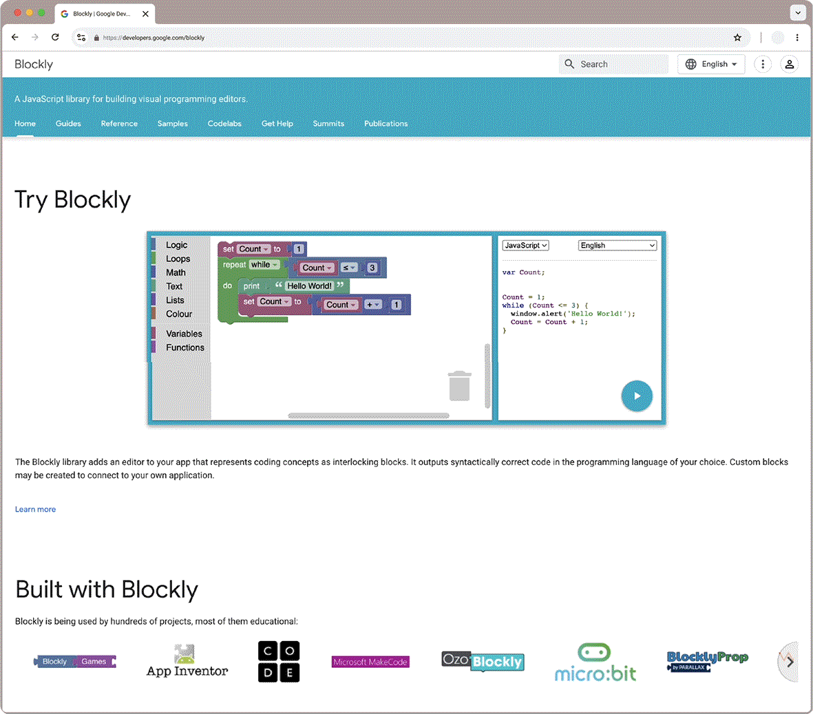
The existing page is nested under Google for Developers
The existing page is nested under Google for Developers
The existing page did not present Blockly as a standalone product and was built with outdated Material Design 1 components.
The page structure did little to help users parse through the information or understand the site’s overall structure.
Interactive elements blended in with the rest of the page and did not get many clicks.
The performance-forward messaging spoke to developers, but did not engage CS Ed Leaders or educators – two audiences that likely had more to learn from an introductory website.
Our new landing page presented an opportunity to clearly communicate Blockly's mission to all users and reinforce its purpose-driven values from the first impression.
Messaging
We held a messaging workshop with the client team to refine Blockly’s core message, align on values, and define its brand voice.
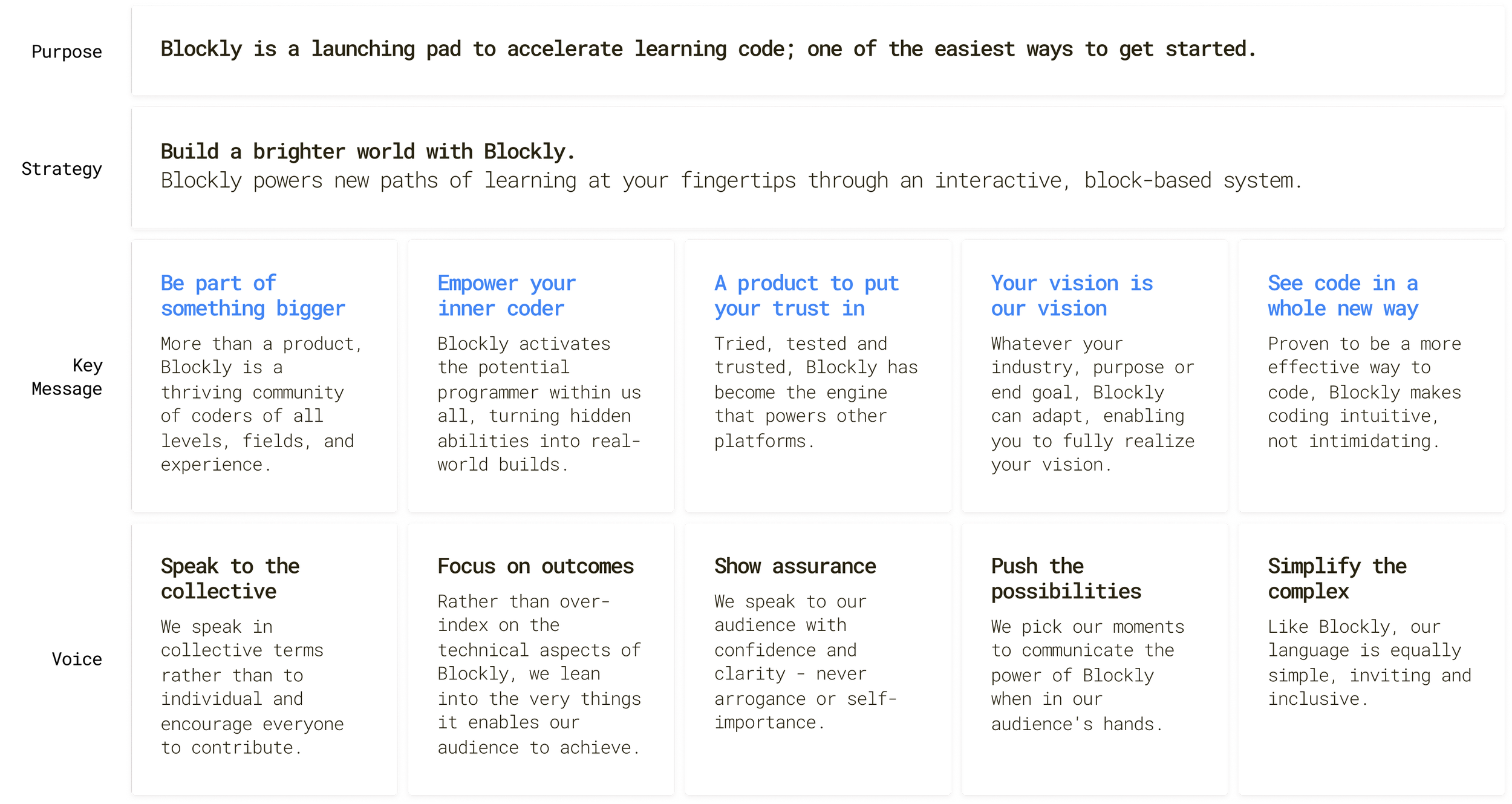
The purpose placemat grounds branding in Blockly’s mission.
Strategy, messaging, and voice all support and reinforce the purpose.
With the content strategy blueprint in place, I needed to structure the message for our landing page format.
I explored both product-led and user type-led narratives to sequence the story starting with what's most relevant to the broadest audience.
Present information progressively from general to specific
While the user type-led narrative can speak directly to each target audience, immediately segmenting users went against our collective messaging pillar.
The product-led approach allowed us to keep everybody together, better communicating that Blockly is for everyone.
Anchoring the brand story in the platform experience, Blockly won't get lost in the sauce when positioned as an ingredient brand.
Design
I mapped our key message pillars to content blocks to clearly lay out and reinforce Blockly’s value proposition.


For each following iteration, I pieced together the wireframe in Figma to fit components to each section of the landing page layout.
final delivery
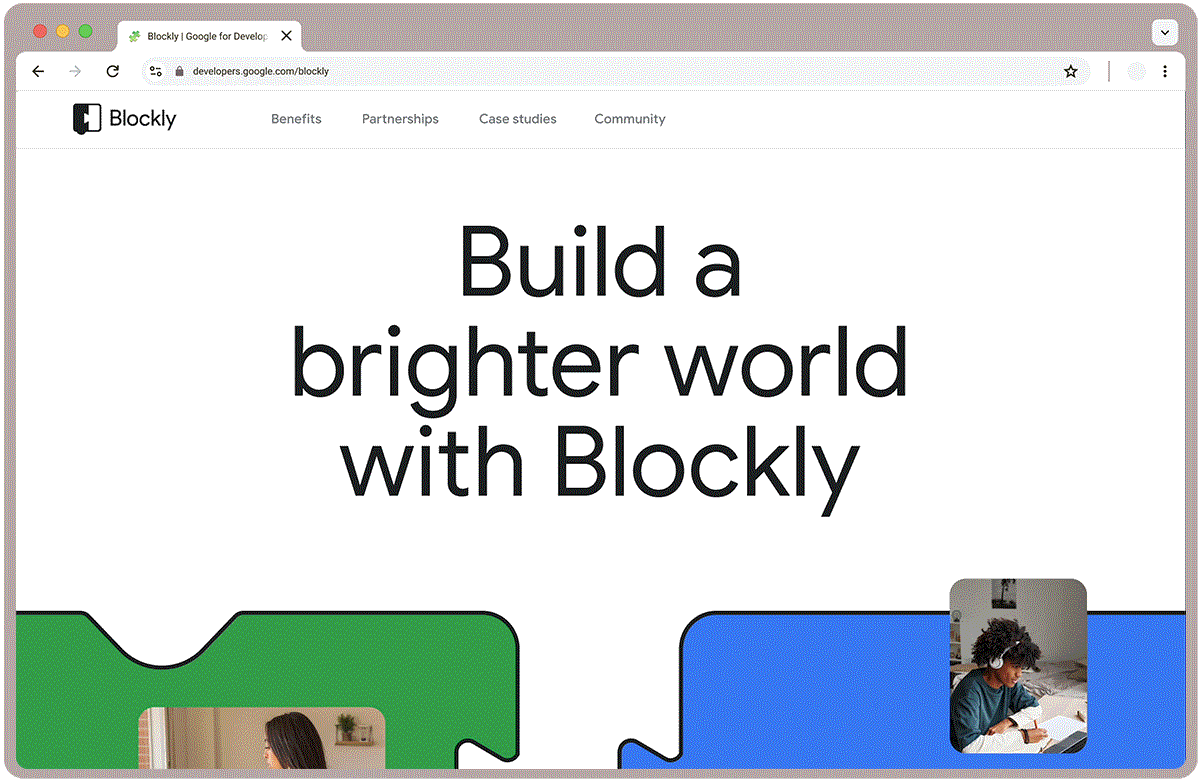
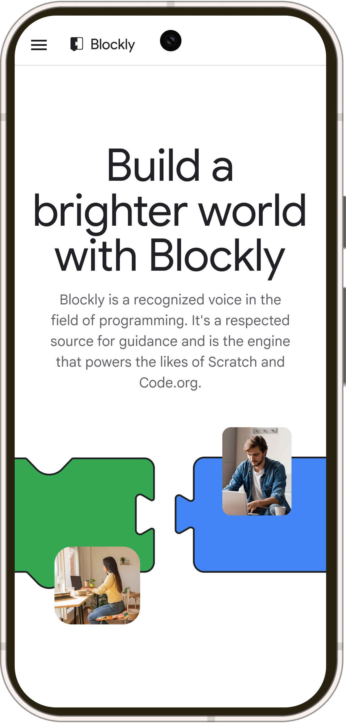
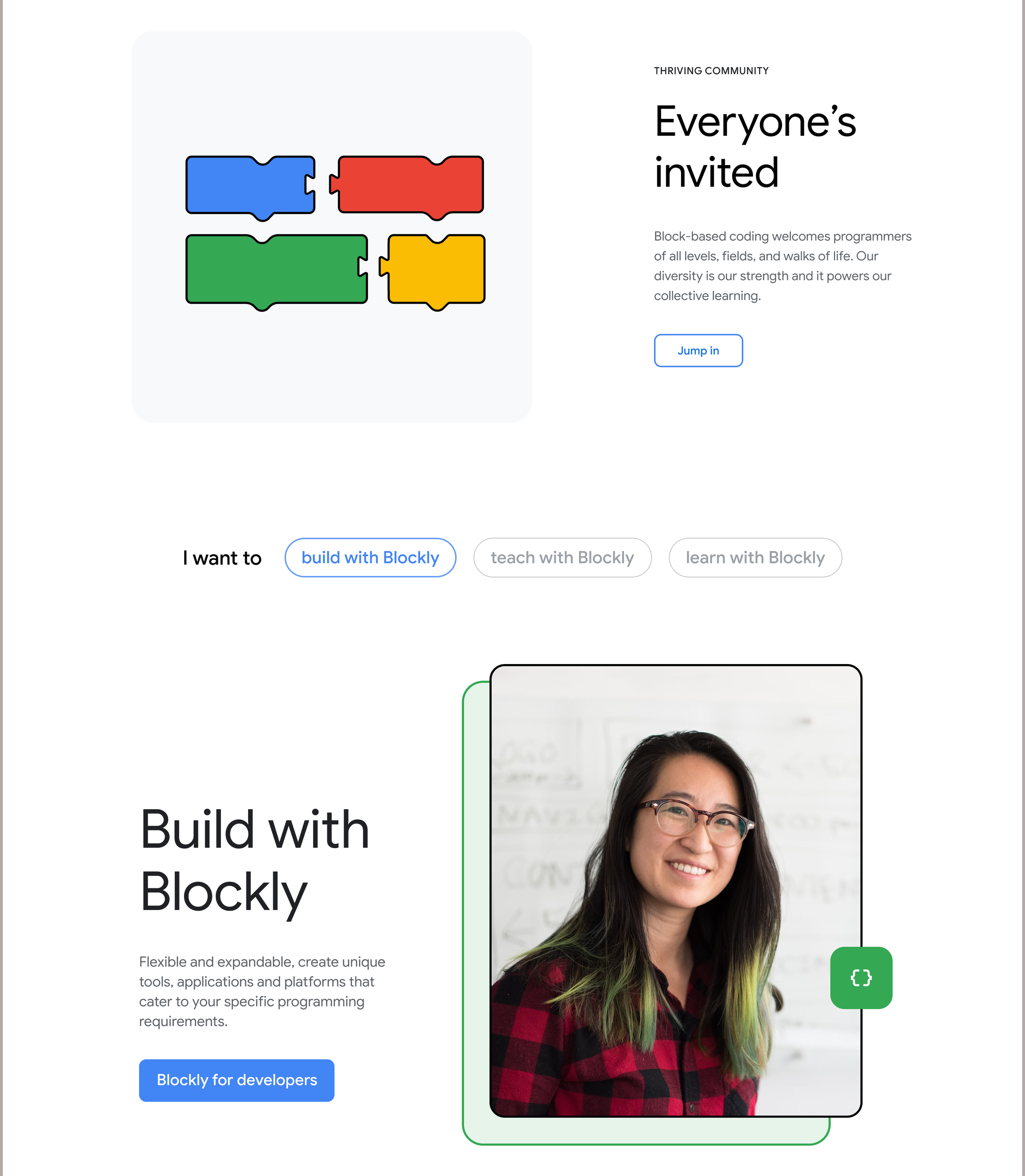
Once the layout was finalized, we applied Athalia and Ignacio’s visual expression to style the landing page mock-up.
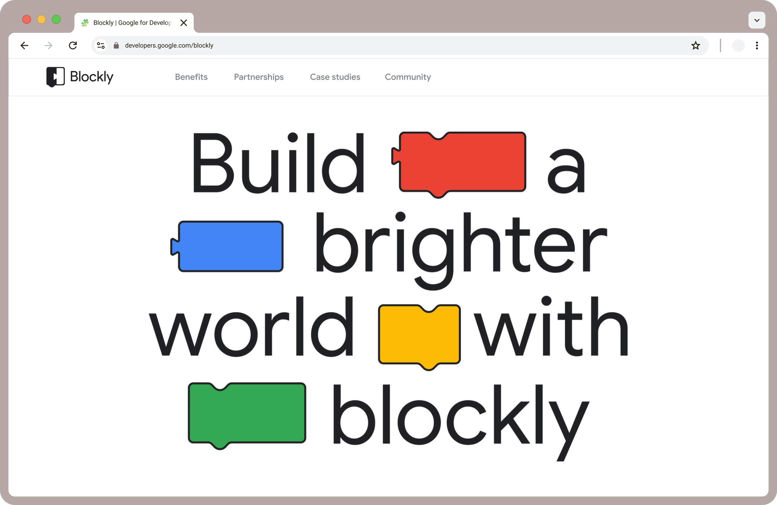
At the end of four weeks, we delivered a single scroll landing page in desktop and mobile laying out Blocky's story. We also included a shorter option breaking out the partnerships section.

1. Introduce
Capture users' attention with high level, emotive synopsis of the product. Whet the appetite and inspire our audience to scroll.

2. Unpack
The value proposition and key benefits told, in an interactive, snackable form. Giving enough information without creating cognitive overload.

3. Summarize
Jumplinks that also act as ‘Contents’. Priming audiences of the information they’ll consume from the page.

4. Build Trust
Proof Points & statistics give weight to our expertise while strengthening trust and credibility amongst audiences.

5. Credentialize
Create association between Blockly and coding products that will be familiar to much of our audience.
6. Speak to Audience
Address Blockly’s target user groups through action oriented language.


7. Drive Action
Leverage the power of renowned platforms and IPs to inspire audiences to act.

8. Create Connections
Offer access to a global community of programmers, that are all collaborating and thriving, as one.
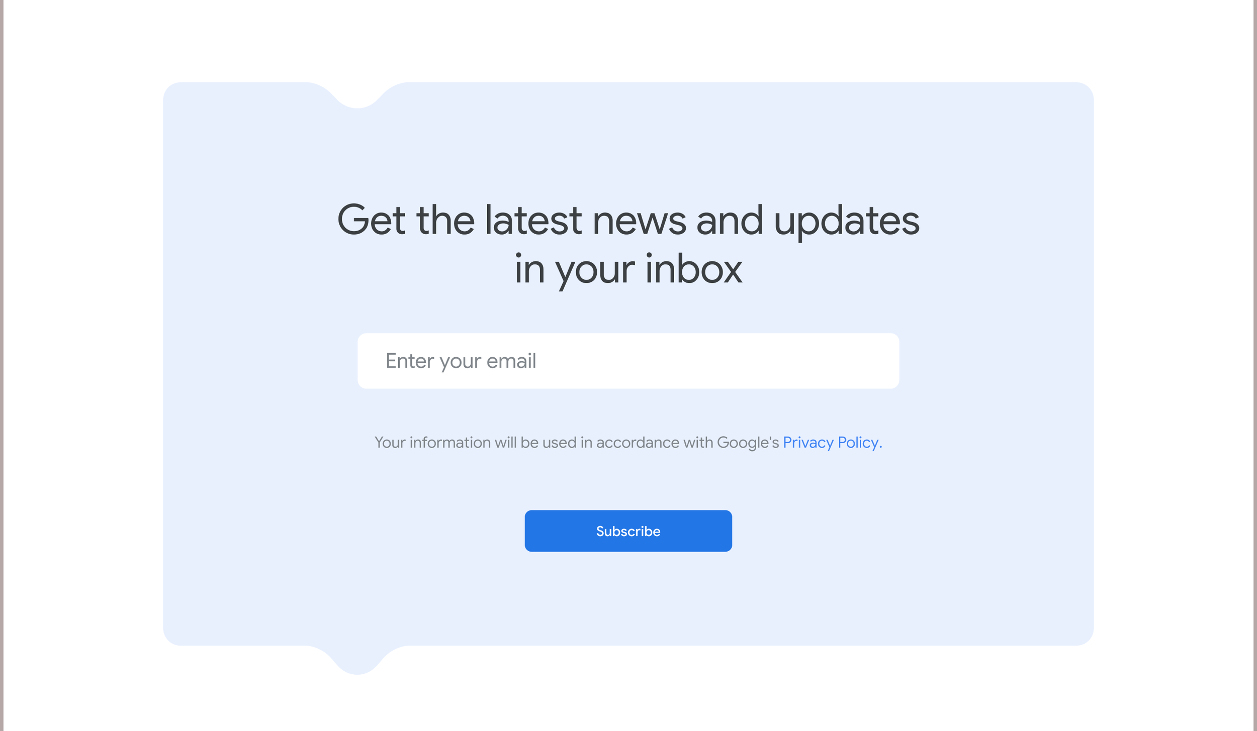
9. Capture Momentum
Capture contact information and convert users who have scrolled this far down the page.

10. Support
Rengage users' attention and redirect to community forum, FAQs, and more content.
Implementation
Visiting the Blockly site today, we can see many aspects of our branding in action.
The landing page is more distinct, more engaging, and – most importantly – clearly states what Blockly is all about.