Working with two other UX designers, I tested the usability of the Women's Congressional Policy Institute website and devised a redesign strategy.
My Role
Data Analysis & Visualization, High-Fidelity Prototyping
The Client
The Women’s Congressional Policy Institute is a nonprofit, nonpartisan public policy organization whose mission is to bring women policymakers together across party lines to work on issues of importance to women and their families.
RESEARCH
The Women's Congressional Policy Institute (WCPI) is a great organization supporting women policymakers.
Their current website, however, is clunky & overladen with content, making it hard to understand exactly what it is that they do.
First-Time Users
We interviewed a group of first-time site users about their thoughts on the current site, asking them for their general opinion of the page.
I also had them try to locate specific information on the site, and quizzed them on basic WCPI information to see what they were able to retain.
Click to enlarge
Takeaways:
Test users were immediately drawn to the picture of the Women's Caucus but found that the many faces and blocks of text made it hard to focus on the information.
"The banner gives you an immediate sense of what the institute does, but the fonts are a bit all over the place"
"The blue color scheme makes me think of Democrats"
"There is a lot to look at. It can be confusing or distracting"
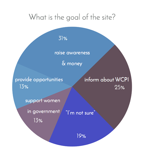
Interviewees were not able to tell exactly what the organization does from the information on the site.
"It's unclear to me what the relationship between the organization and the government is"
"I think that the goal of the site is get people to support the organization by donating or volunteering? I'm not really sure"
"I would like to see the issues laid out more succinctly and in an easier-to-read way"
When asked to describe the site, test users agreed that the site looked professional, but also found the homepage jam-packed with info & hectic.
"Busy — I don't know where to look first"
"It looks professional, but a bit busy and wordy"
"Old fashioned... and blue?"
Former Fellows
We also interviewed several former WCPI fellows about how they used the site. They agreed that the site is "overwhelming," "dated," and "hard to maneuver."
According to the fellows, the most valuable information on the site is:
- More event information
- Fellowship and hiring information
- Briefing materials and Caucus materials
And they would like to see the site include:
- Information about what female members of Congress are doing
- More information about the fellowship & chief of staff programs
- Share more stories & examples about the work WCPI is doing
VISUAL DESIGN
When asked what adjectives their website should covey, WCPI agreed on the following:
bipartisan, optimistic, facilitators, engaging, professional, resourceful
We put together a mood board and style guide that would reflect WCPI's envisioned image.
Click to enlarge
Click to enlarge
Sketching
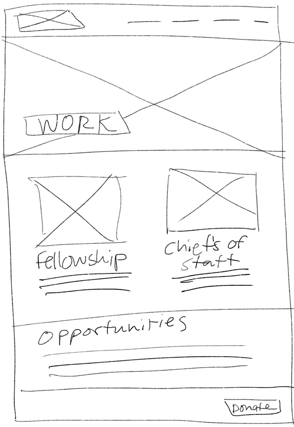
With openness & clear communication in mind, I sketched out ideas of simple page layouts prioritizing white space.
I wanted to incorporate more candid & natural pictures of WCPI's members to convey warmth, professionalism, and poise.
PROTOTYPE
I built mock-ups of three pages below in Sketch:
WHAT'S NEXT?
WCPI loved our web redesign proposal. We are currently in the process of further validating our design through usability testing and building it out for the relaunch later this year.


