I designed the landing page for The Layover mobile app concept and built it the front end with HTML, CSS, & Javascript.
The Product
The Layover is a mobile application designed to help travelers take advantage of time between flights. With detailed airport information and to-the-minute flight updates, the world traveler will never miss another flight. The app also has city guides with activity suggestions based on the length of your stop.
RESEARCH
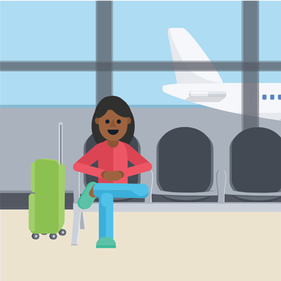
I began by considering The Layover's target user: the Millennial traveler.
Millennials planned more trips and were more likely to travel abroad 2017 than GenXers or Baby Boomers (AARP, 2016). Demographically, Millennials are also far more likely to use mobile travel apps and to rely on online content, such as user reviews, when making travel arrangements (Boston Consulting Group, 2013).
As travelers, Millennials seek choice, flexibility, and the option to combine business and leisure travel (TrekkSoft, 2016). As digital natives, they also move quickly and expect their tech to do the same (Virtuoso, 2014).
I looked at landing pages for products aimed at similar user bases. I noticed that really great pages, like Moments, Qapital, & Oscar, managed to be engaging, yet simple, with illustrations & subtle animations.
Sketches
I decided I wanted to create a single-scroll design that was interactive but not fussy to capture users' interest without demanding too much time or attention.

With a single but long page to lay out, I tested out different ways to showcase the app and it's features to potential users without overloading them.
I also sketched out a wireflow for the app itself. Focusing on The Layover's primary function, to provide suggestions of what to do during a layover, I devised two distinct user flows: entering flight details and the finding something.

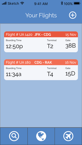
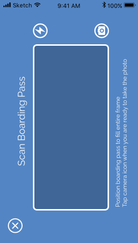
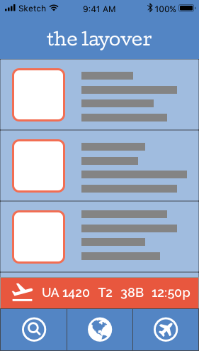
I designated the Flights screen of the app to keep the important information — flight number, time and gate — front and center. In the bottom navigation, I included the app's three major sections: search, location information, and flight info.
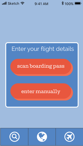
As travelers are often carrying bags or food, or are on-the-go, I didn't want to occupy their hands for too long. With the option to enter flight info by record locator or scanning your boarding pass, users can skip a lot of cumbersome typing.
VISUAL DESIGN
I also noted that successful landing pages commonly had bright color schemes, punchy copy, and inviting illustration. Following this, I put together a mood board with snippets of text and illustrations that would speak to the young, adventurous target user.

Illustration
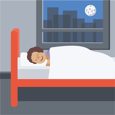
I have always loved flat design illustration so I was very excited to make some of my own. My goal was to design amiable & relatable illustrations that create a narrative about how the app could be used.

Mock-Up
After several iterations, I made a mock-up of the page in Sketch & showed it to a group of test users. I've included some of their comments in yellow below.

Iterations
Following the feedback I received, I made several changes to the design including:

Reconfiguring the header navigation content

Getting rid of the confusing dots and the divisive "try now!" button

Redesigning the "Download" section — no more plane crash.
Based on tests of my UI design, I added a Next Flight Reminder bar above the bottom navigation.
DEVELOPMENT
Once I began writing code, I was able to make the page come to life by adding interactions.
I had planned to fix the header navigation to the viewport, but after user testing, I added the logo to the section as well.
Using JavaScript to change the css attributes, "The Layover" fades into view when the user scrolls past the hero image and back out again if the user returns to the top of the page.
I added CSS hover animations to the map section to entice the user to interact with the page.
At first, I coded a blinking effect using the transform & transition properties but I wasn't able to achieve the twinkle I was imagining.
Using @keyframe animation instead, I was able to more precisely control the animation and have it run infinitely.
I changed the "Coming Soon" section to instead ask users to suggest where the app should go next.


Combining the "Contact" & "Keep in Touch" sections, I designed a "Contact" sidebar accessible from any point of the page.
Coding smooth transitions was particularly challenging.
I began by using JavaScript to change the width of the sidebar and the left margin of the main section but the elements inside the sidebar were still visible.
Adding a class with "display: none;" however, resulted in an unnatural, instant transition.
In the end, after many failed code combos, I realized that I could change an element's transition property with the jQuery .css() method, as I had already done with the opacity property in the header.
What's Next?
Front-end design development is one of my favorite aspects of UX Design so I am definitely going to keep working on this project. I would like to recreate the GIF animations with css for a cleaner look. In addition, although the site is somewhat responsive already, I would like to take the time to make it fully adaptive.